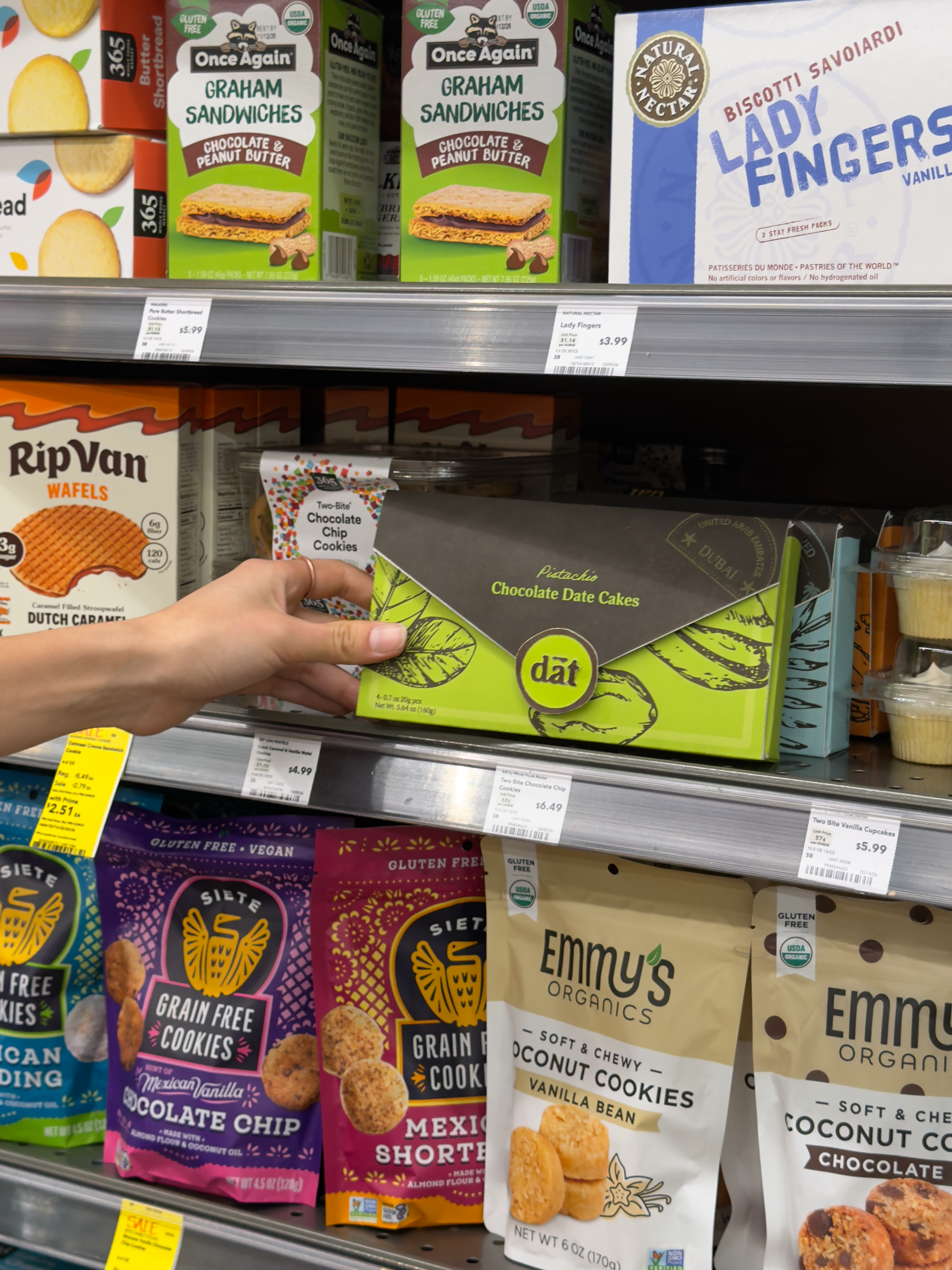
Dāt creates travel themed bite-sized cakes sweetened with one of the world’s oldest traveling fruits, dates.
DISCIPLINES
Brand Identity
Marketing
Packaging
Illustration
GRAPHICS TEAM
Samantha Heintz
Aviv Kesar
Halina Herc
TIMELINE
Winter 2026
10 weeks
PACKAGING TEAM
Tyler Innes
Marissa Johnston
Eddie Chow
Izack Padilla

PROJECT BRIEFPaper packaging is sustainable and recyclable. To increase its use, this year's Paperboard Packaging Alliance Design Challenge asks students to design an influencer PR box for an original luxury confectionery brand that holds the retail product inside.
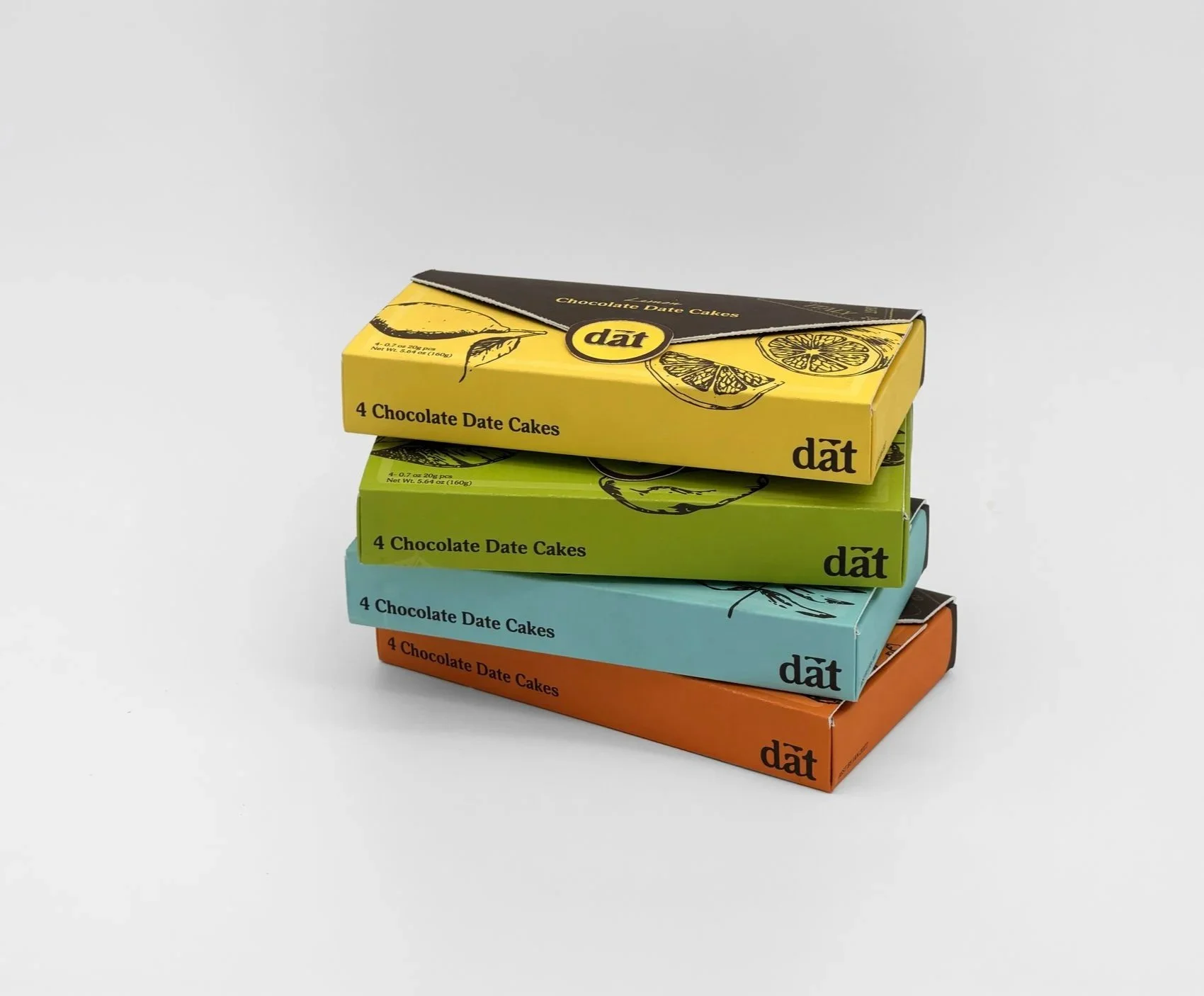
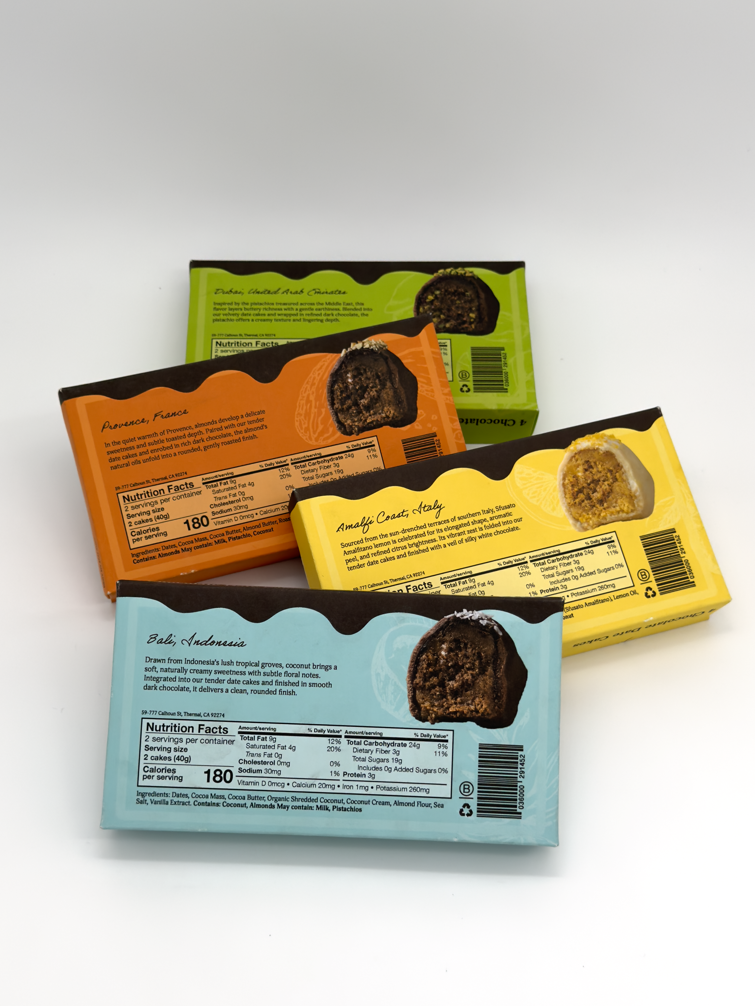
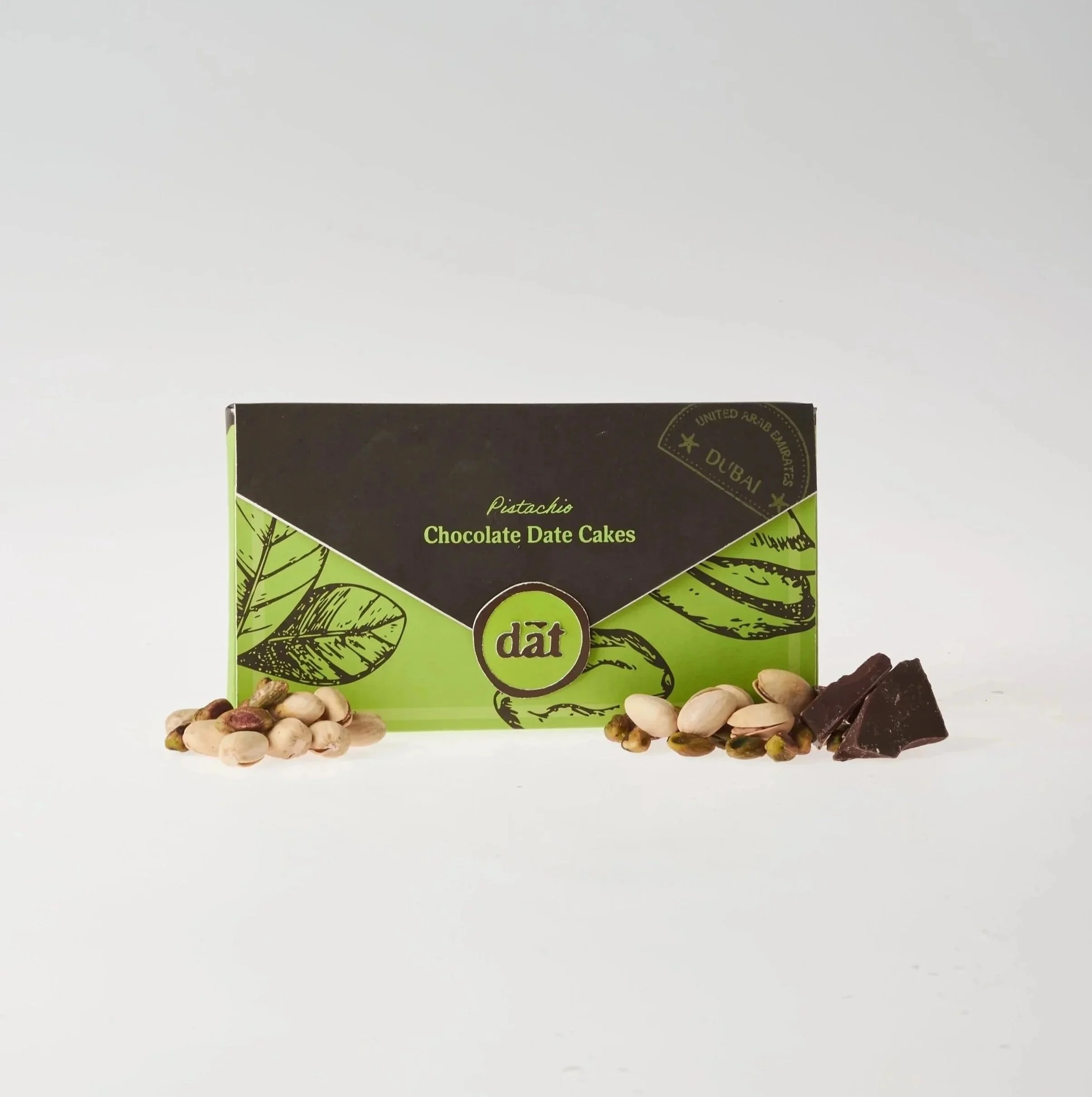
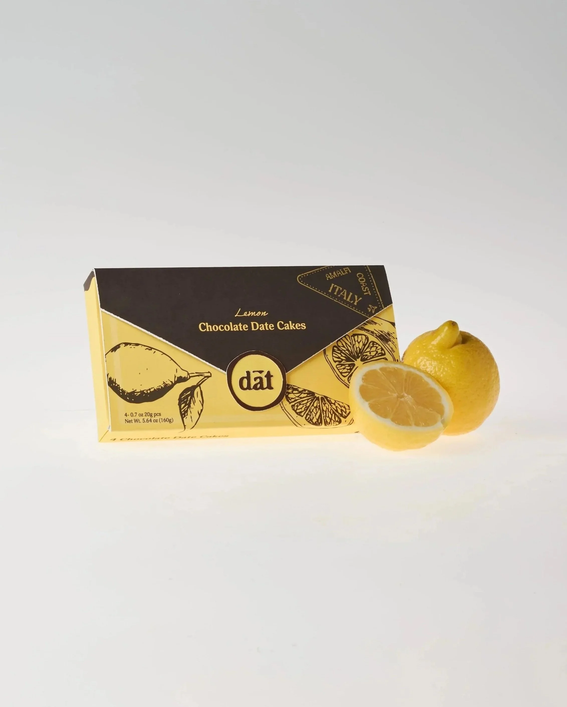
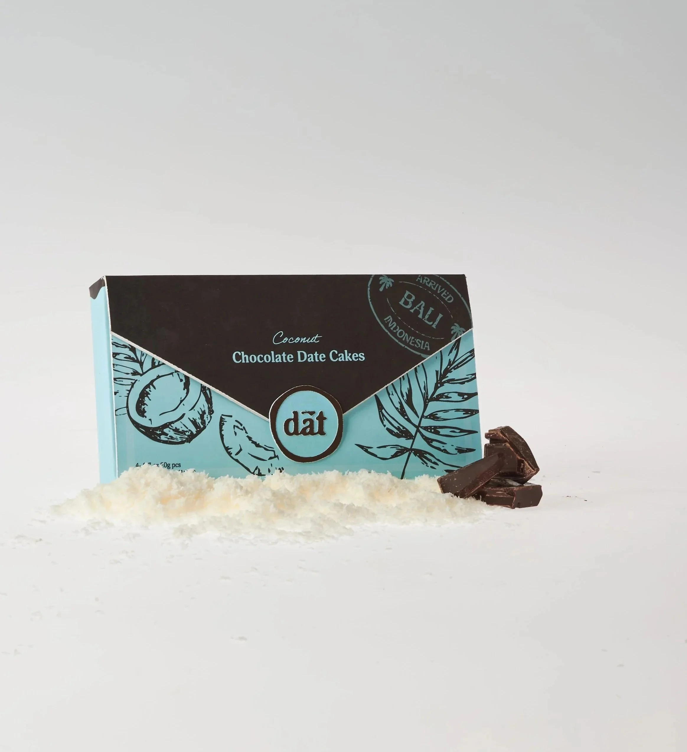
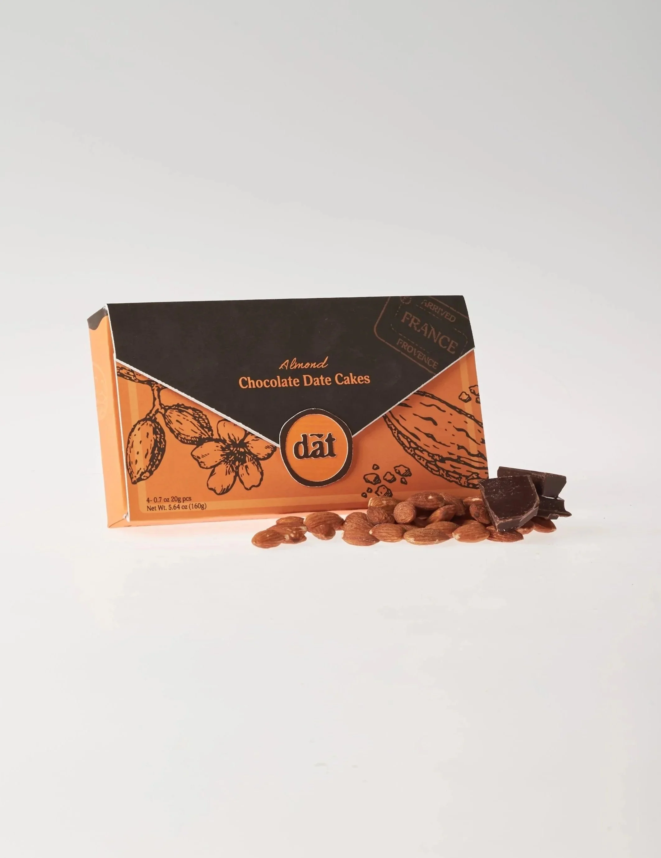
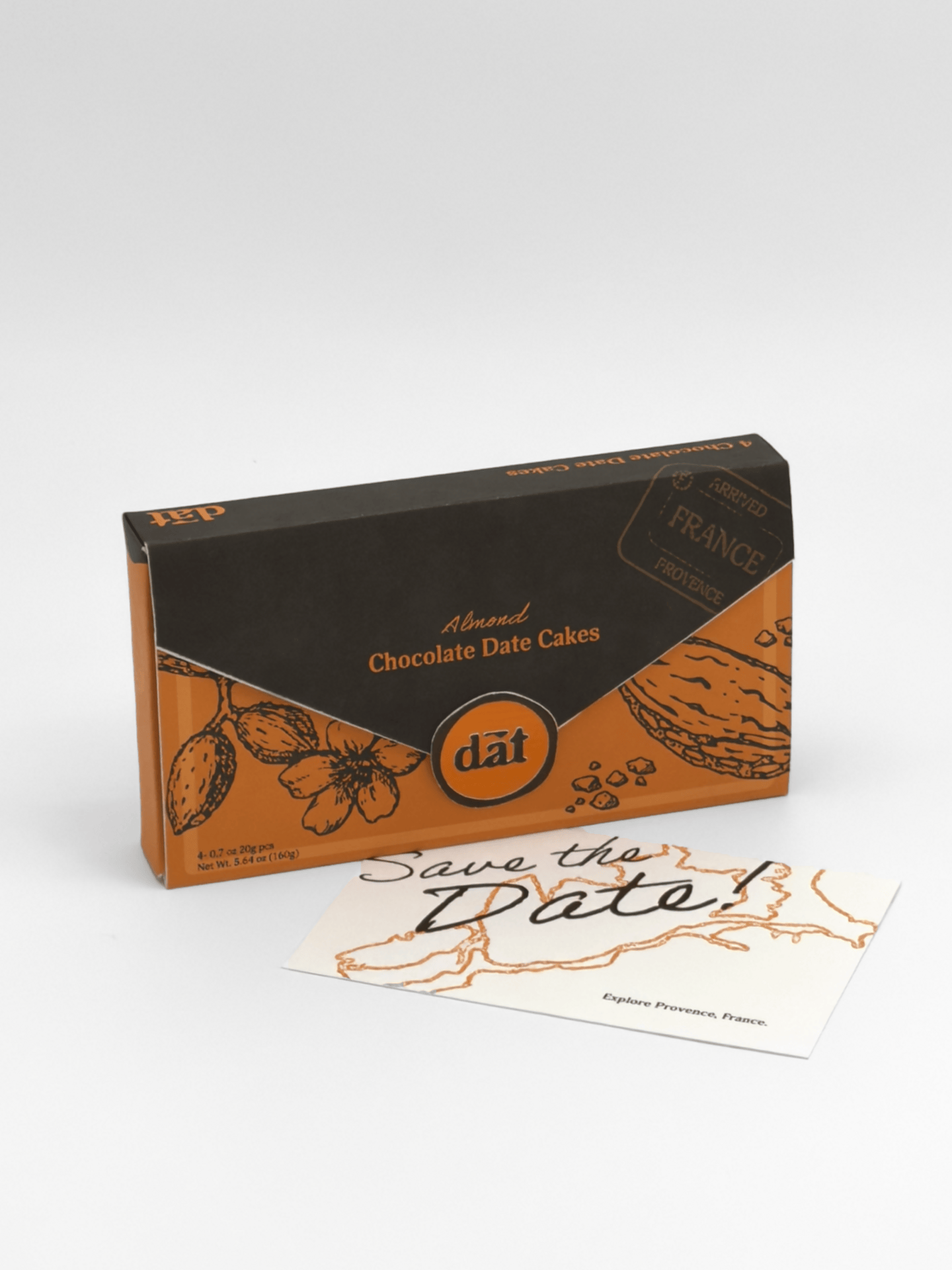
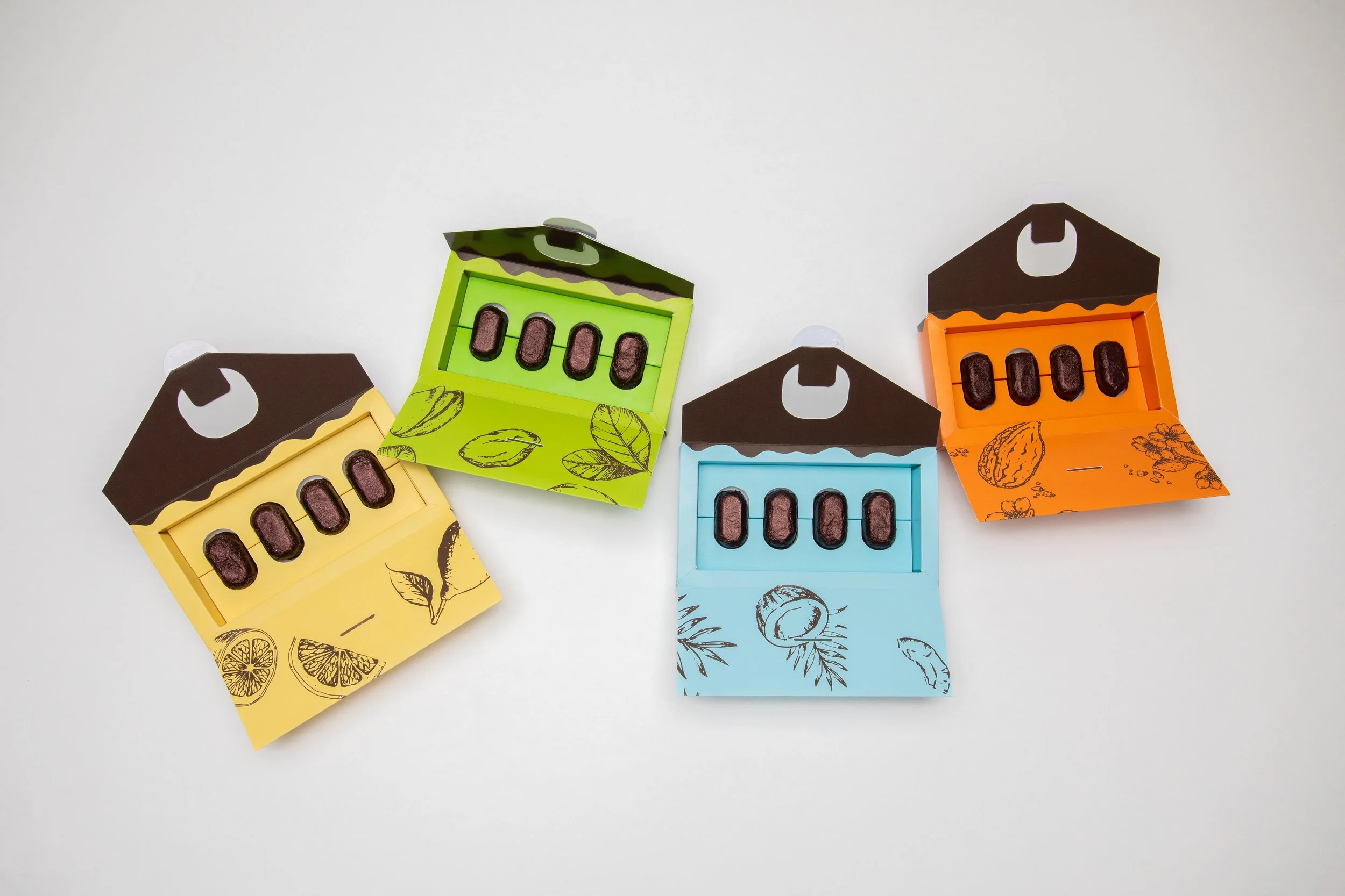
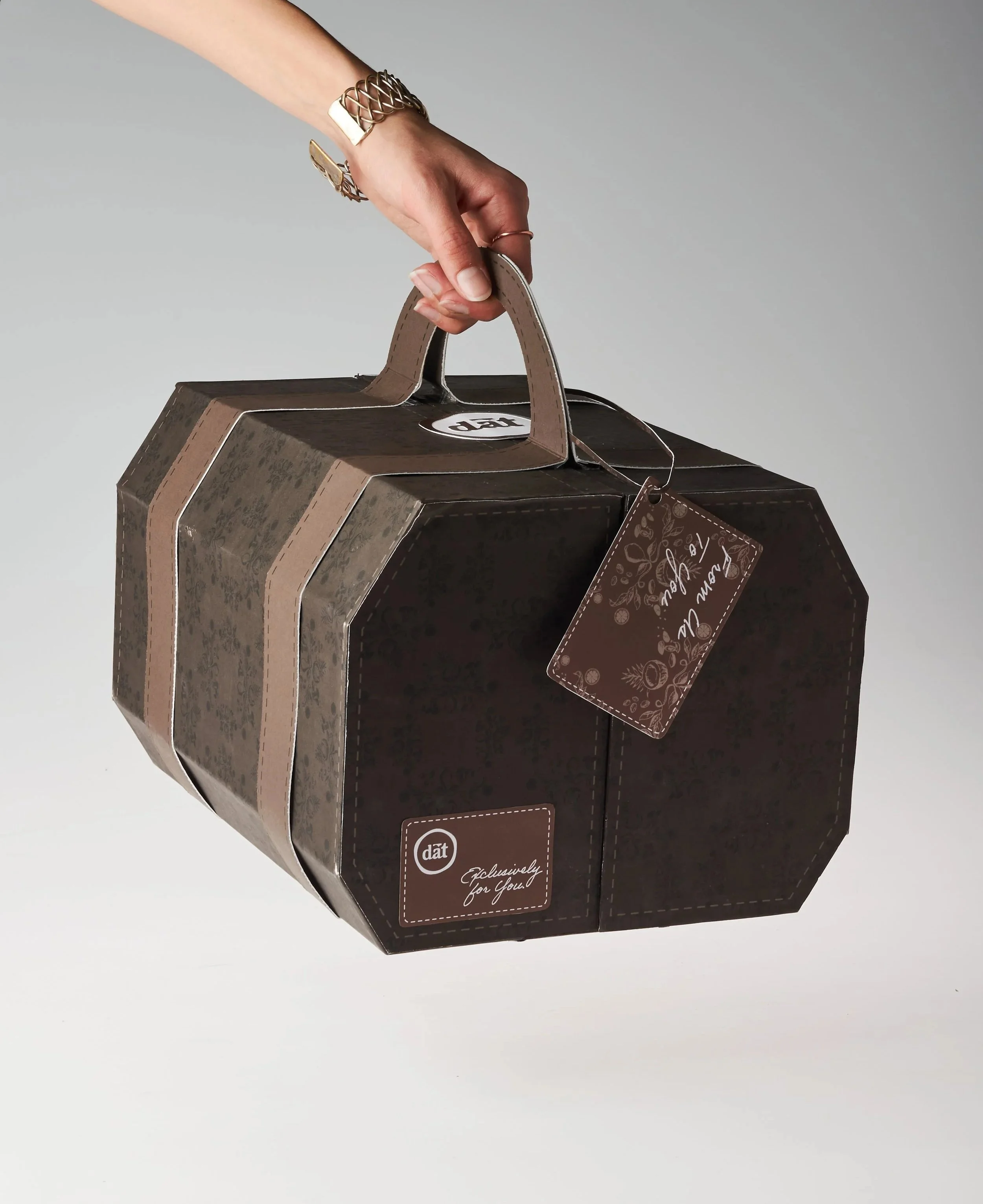
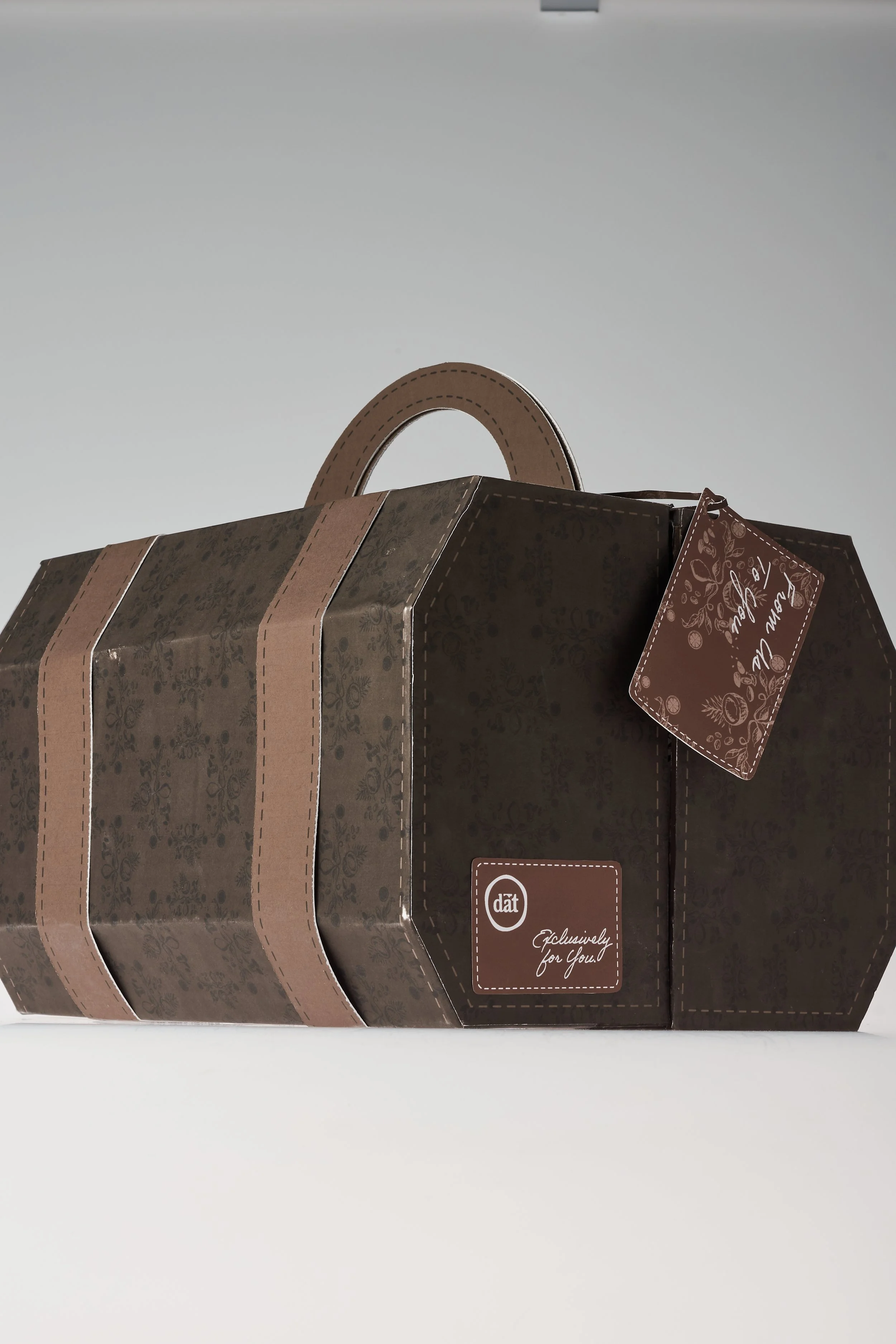
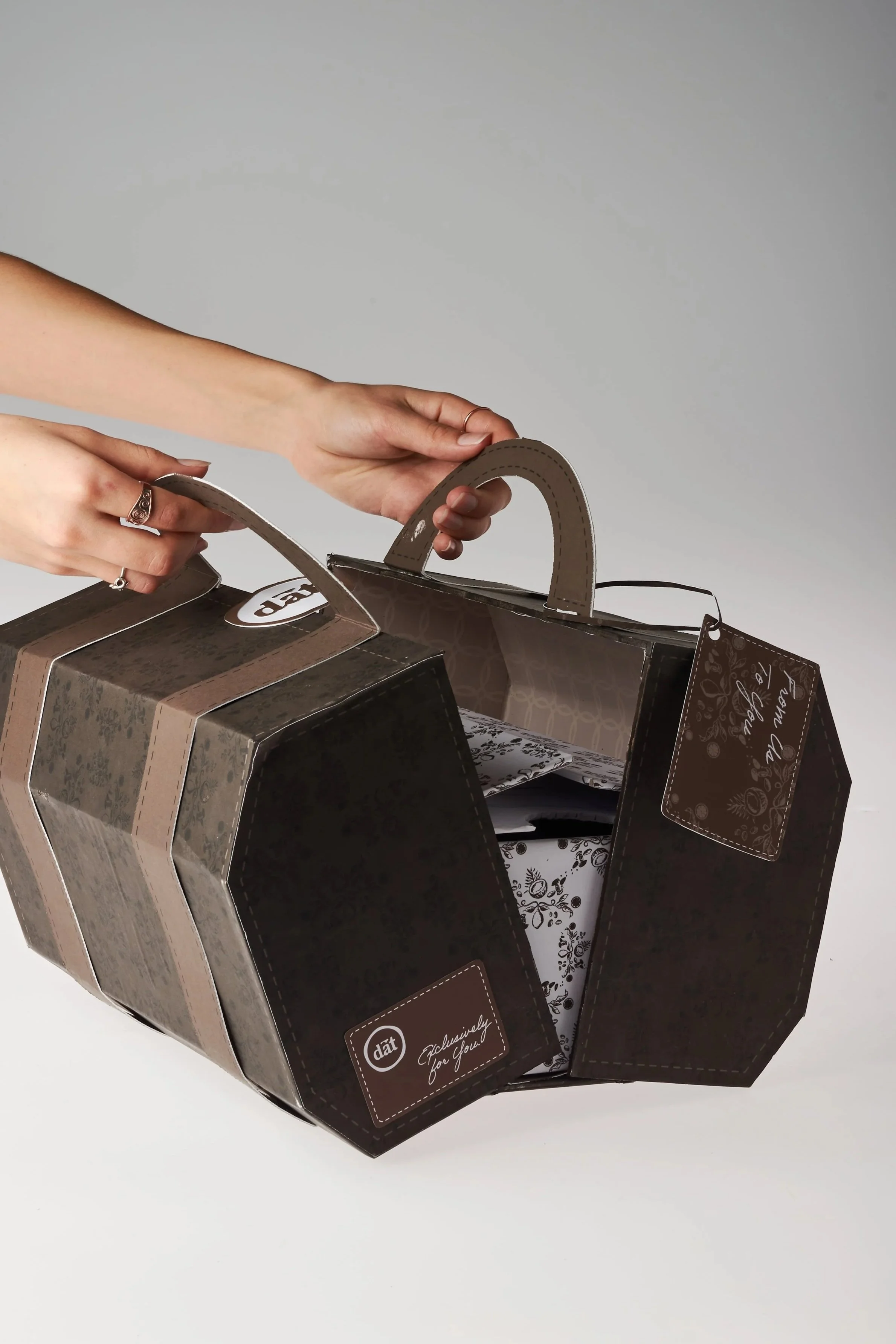
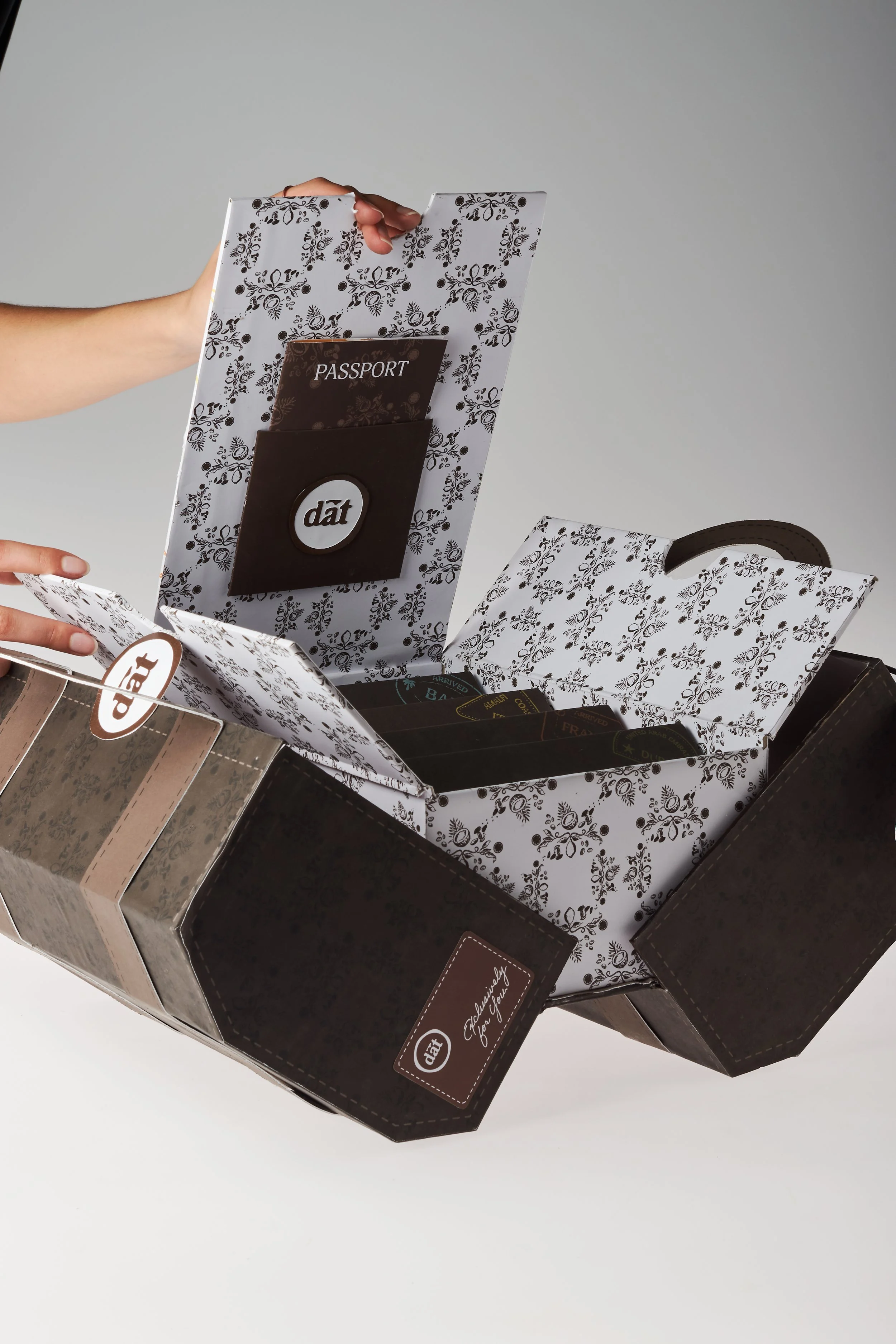
CONCEPTAfter identifying a gap in the market, our team developed chocolate-covered date cakes, transforming one of the world's oldest fruits into a naturally sweet, on-the-go treat. Inspired by travel, we created an immersive brand experience featuring postcards, a passport, and a luxury travel bag-inspired PR package. Centered around the slogan “Save the Date,” the campaign blends themes of travel and connection, encouraging influencers to share the experience together.
Process
IDEATION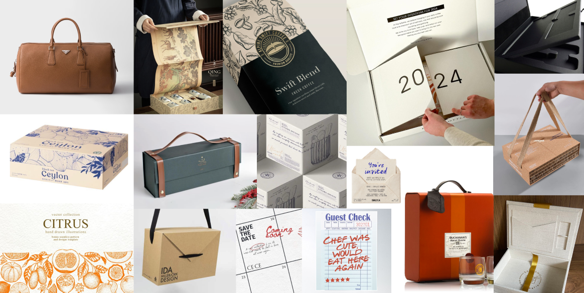
Gathered moodboard inspiration for structural aspects, illustrations, and other concepts that we wanted to include in both the PR package and the retail package.
STAMPSBrand Design System
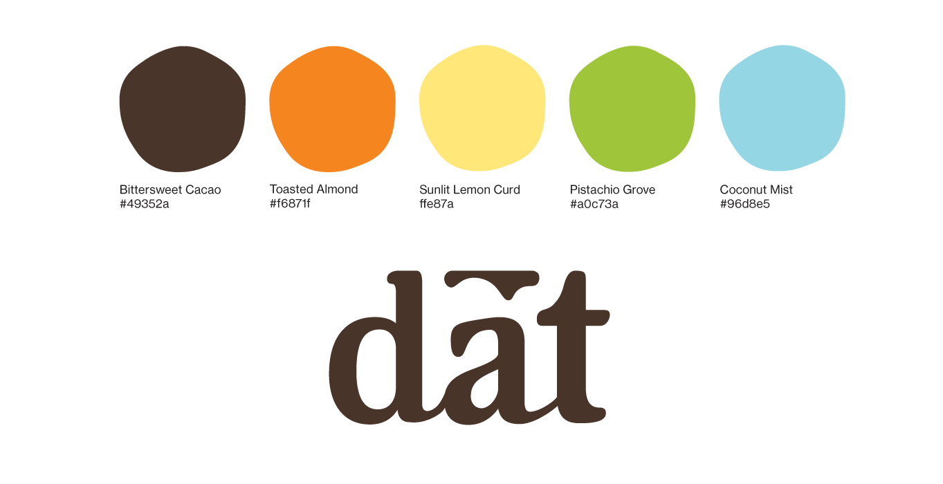
TYPEFINAL BRANDINGWe made the final logo more smooth and fluid to better match the product’s richness. Lowercase letterforms bring a warmth to the mark, while the ligatures give a nod to the elegant typefaces that shaped our early design direction. After some tweaking of the active color palette to ensure that the different flavor colors matched in saturation, we landed on the Dat color palette.
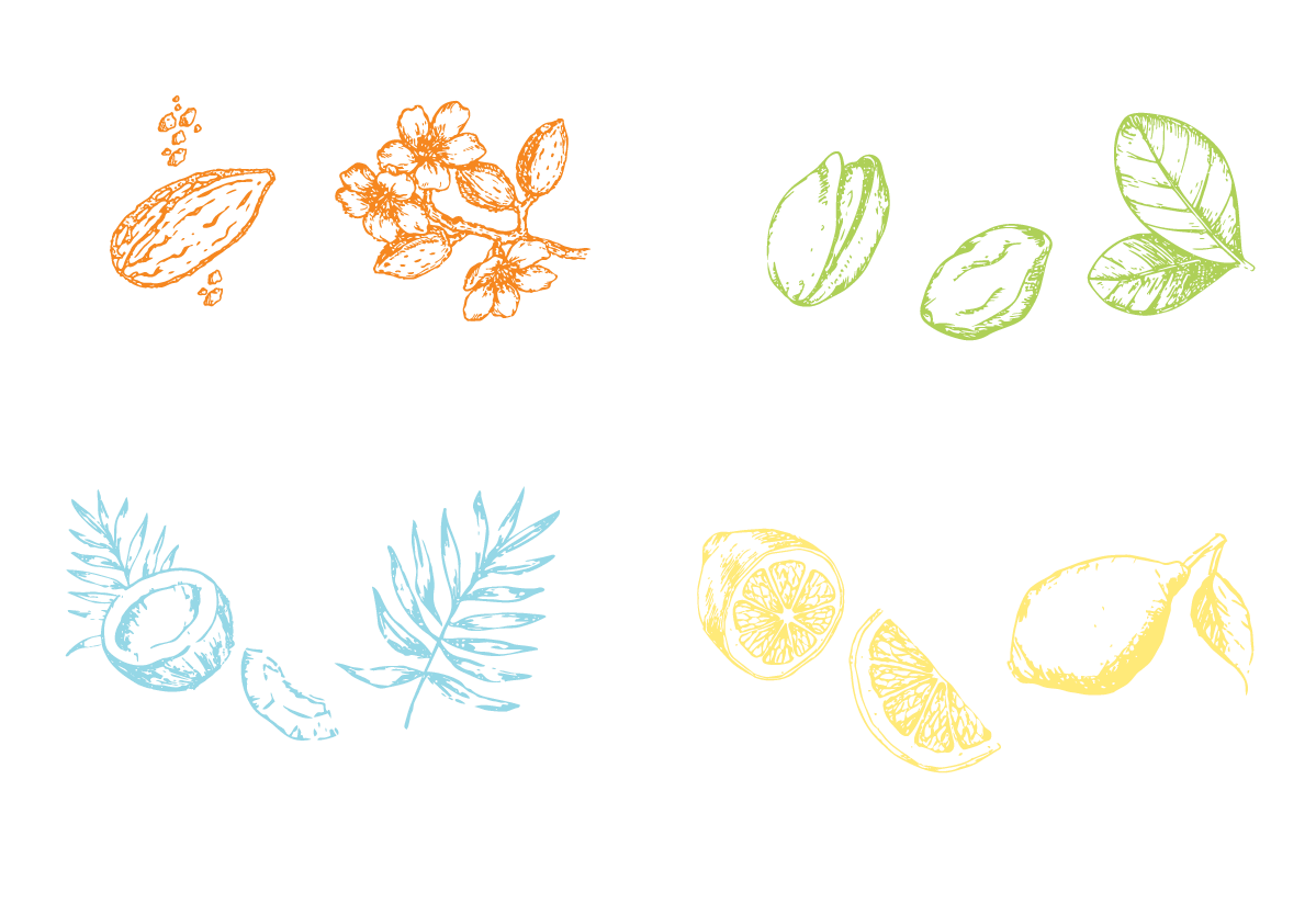
Illustrations
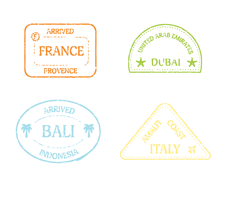
Location stamps drawn from the bold aesthetic of passport stamps, evoking discovery and destination. Ingredient illustrations had that same stamp-like quality.
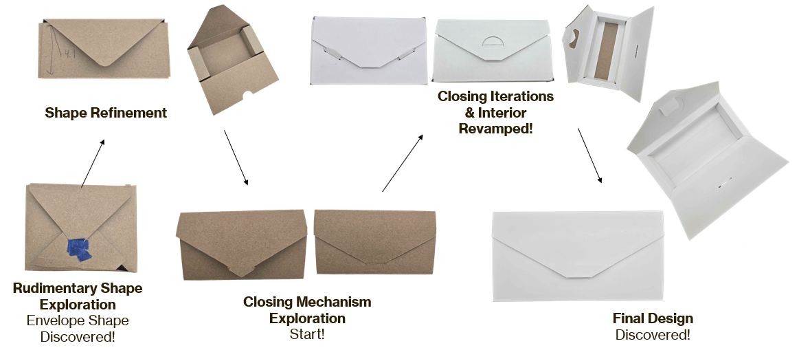
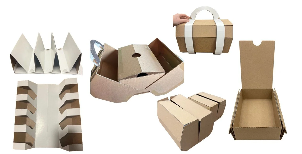
Prototypes
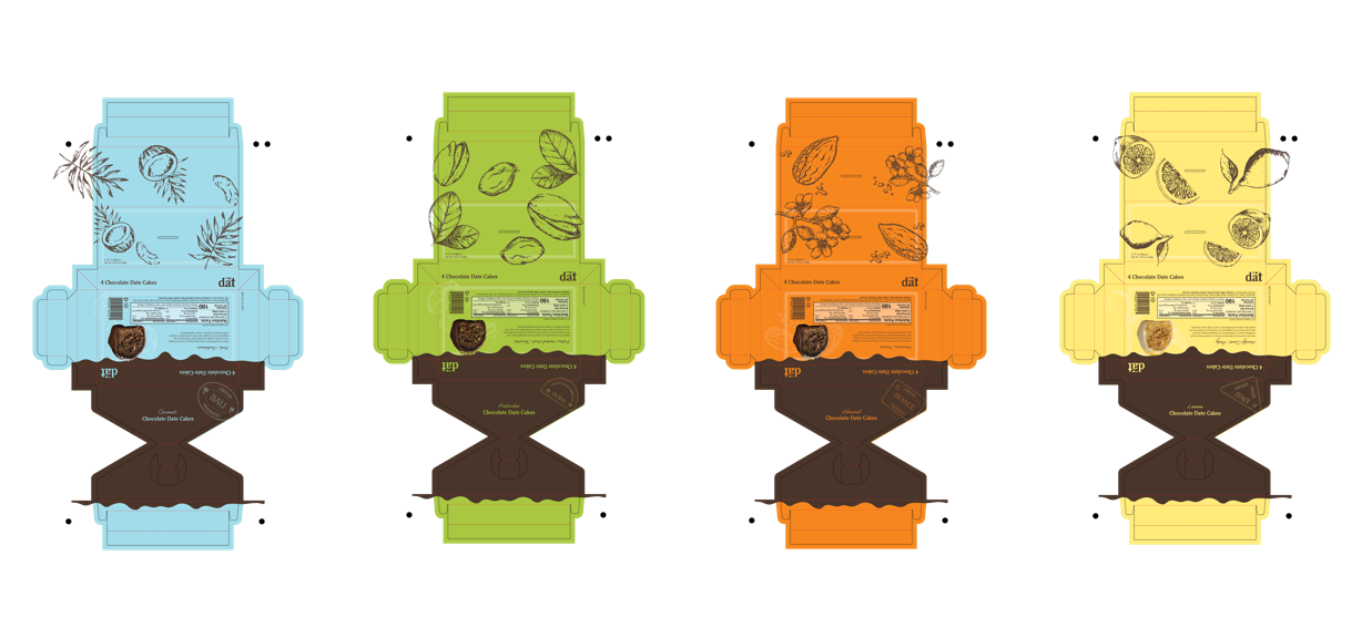
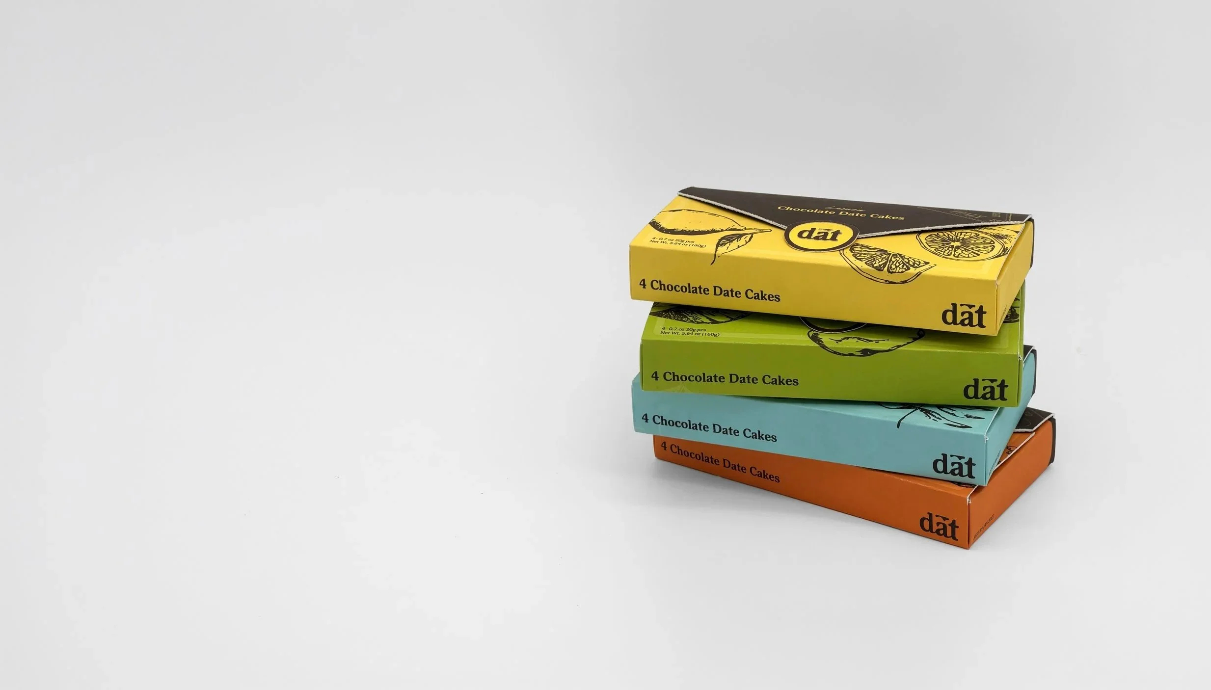
Retail Package Final Dielines
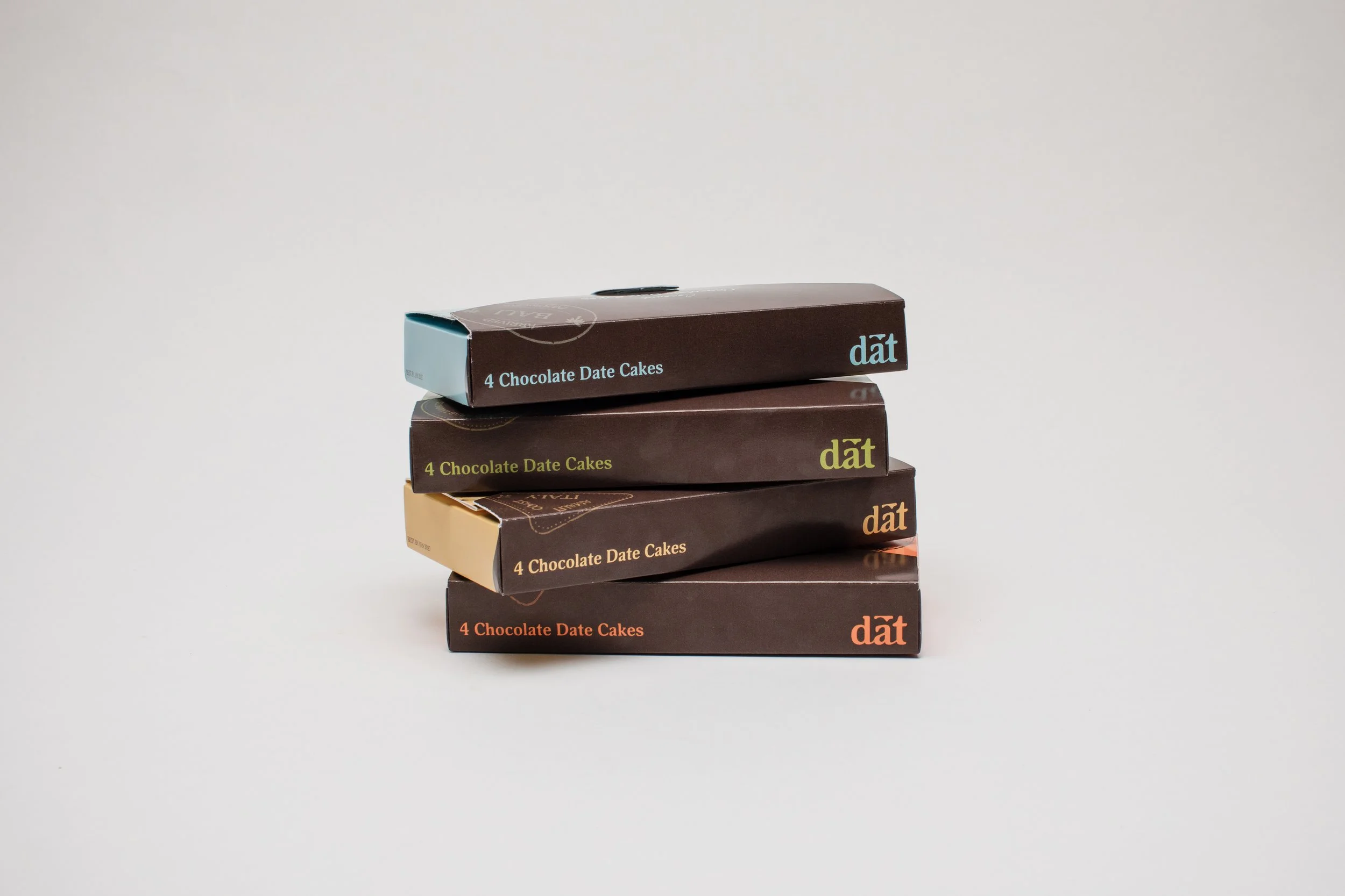
Retail Product Photography
For next time…
TAKEAWAYSThis project has been one of the most rewarding and challenging experiences during my time at Cal Poly. Collaborating with Industrial Technology and Packaging majors offered valuable insights and allowed me to learn from their expertise. This project required adaptability and responsiveness, as dielines were continuously updated based on feedback from our biweekly professor meetings. This experience showed me how to navigate evolving design constraints while maintaining a cohesive creative solution.