
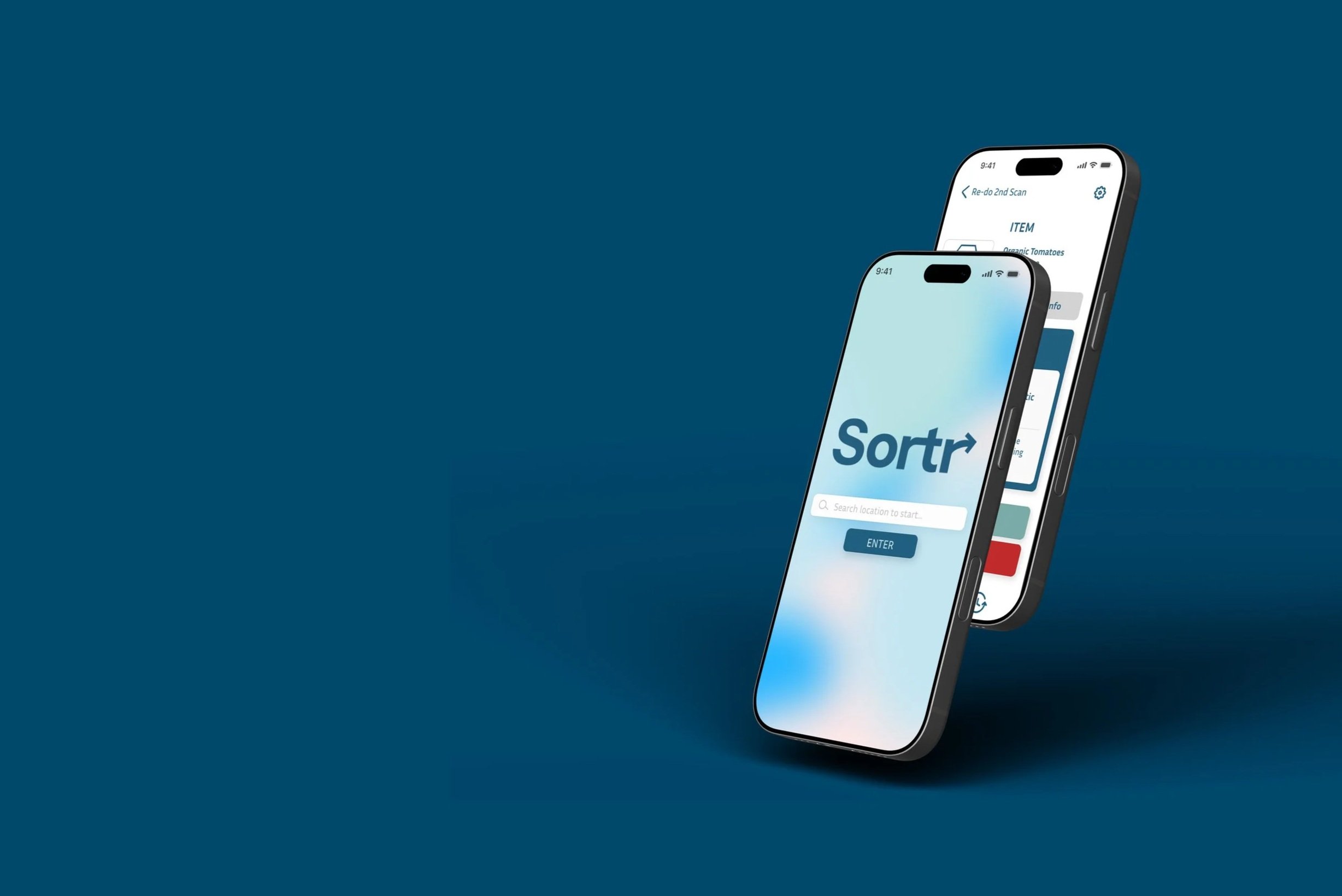
Sortr is a recycling app designed for young adults, making sustainable habits simple and engaging through intuitive scanning features.
DISCIPLINES
UI Design
UX Design
Data Visualization
TEAM
Solo Project
TIMELINE
Fall 2024
3 weeks
ROLE
UI/UX Designer
Graphic Designer
PROJECT BRIEFDesign an original and inclusive mobile application using an iterative process utilizing the following research methods: contextual inquiry, empathy mapping, impact/effort matrix, case study.
PROBLEMPeople don't have enough information readily available on how to recycle. This negatively impacts the environment as well as wildlife conservation.
TARGET USERIndividuals who're environmentally conscious and seeking ways to reduce their waste or younger users who're interested in sustainable practices and would appreciate an app that teaches correct disposal methods.
Process
CONTEXTUAL INQUIRY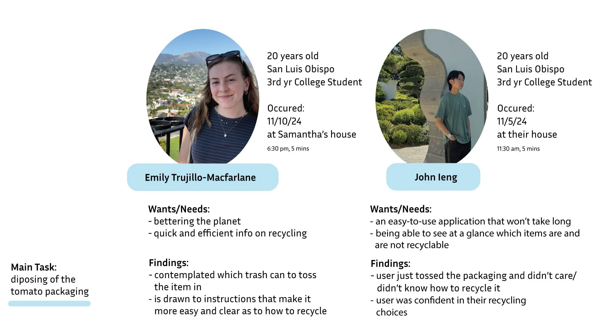
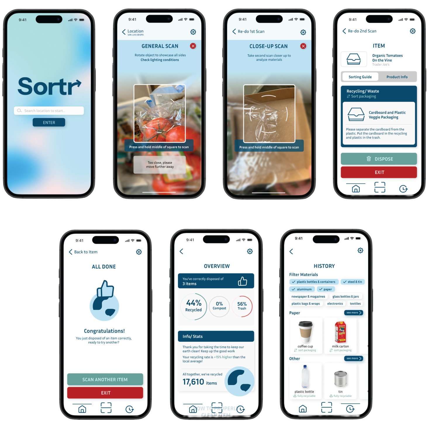
The task was to dispose of the tomato packaging, which consists of both cardboard and plastic. By giving the users packaging with two different materials, it gave them the option to separate or not separate the materials. Based on the findings of this task, I decided to have two different scanners: one that took a broader scan of the packaging, and one that took a close-up scan of the specific materials.
EMPATHY MAP
During my research, I noticed that many participants were confused and questioned where to toss the given items. Therefore, I knew the application had to be simple, with a minimal amount of screens, but also encouraging with stats to encourage the user to keep recycling.
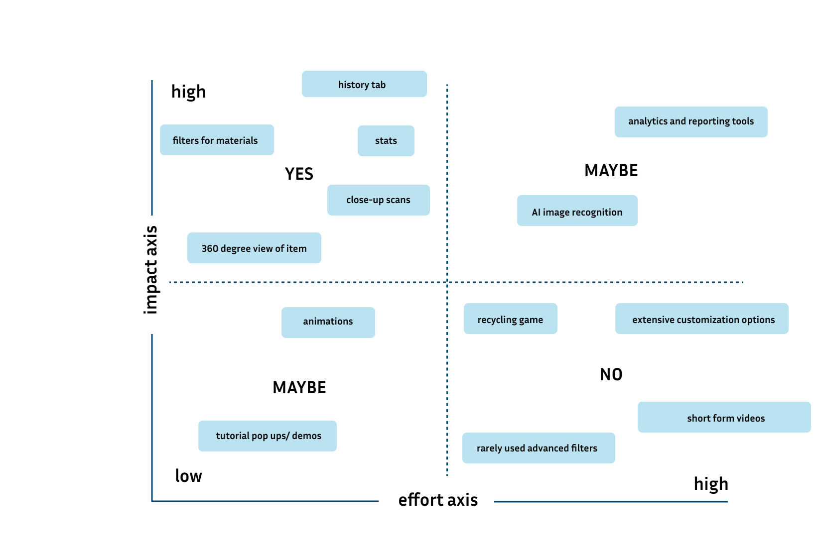
I took this data into consideration while creating the app. It was crucial that I include a history tab, the user’s recycling statistics, close-up 360 scans, and filters to sort through materials for a seamless user experience.
IMPACT EFFORT MATRIX
Final Screens
For next time…
TAKEAWAYSI really enjoyed the process of coming up with a conceptual application, and inventing solutions for a common problem. If I were to do this project again, I’d explore other typeface options and expand on how to properly prepare the disposable items for recycling, trash, or compost.