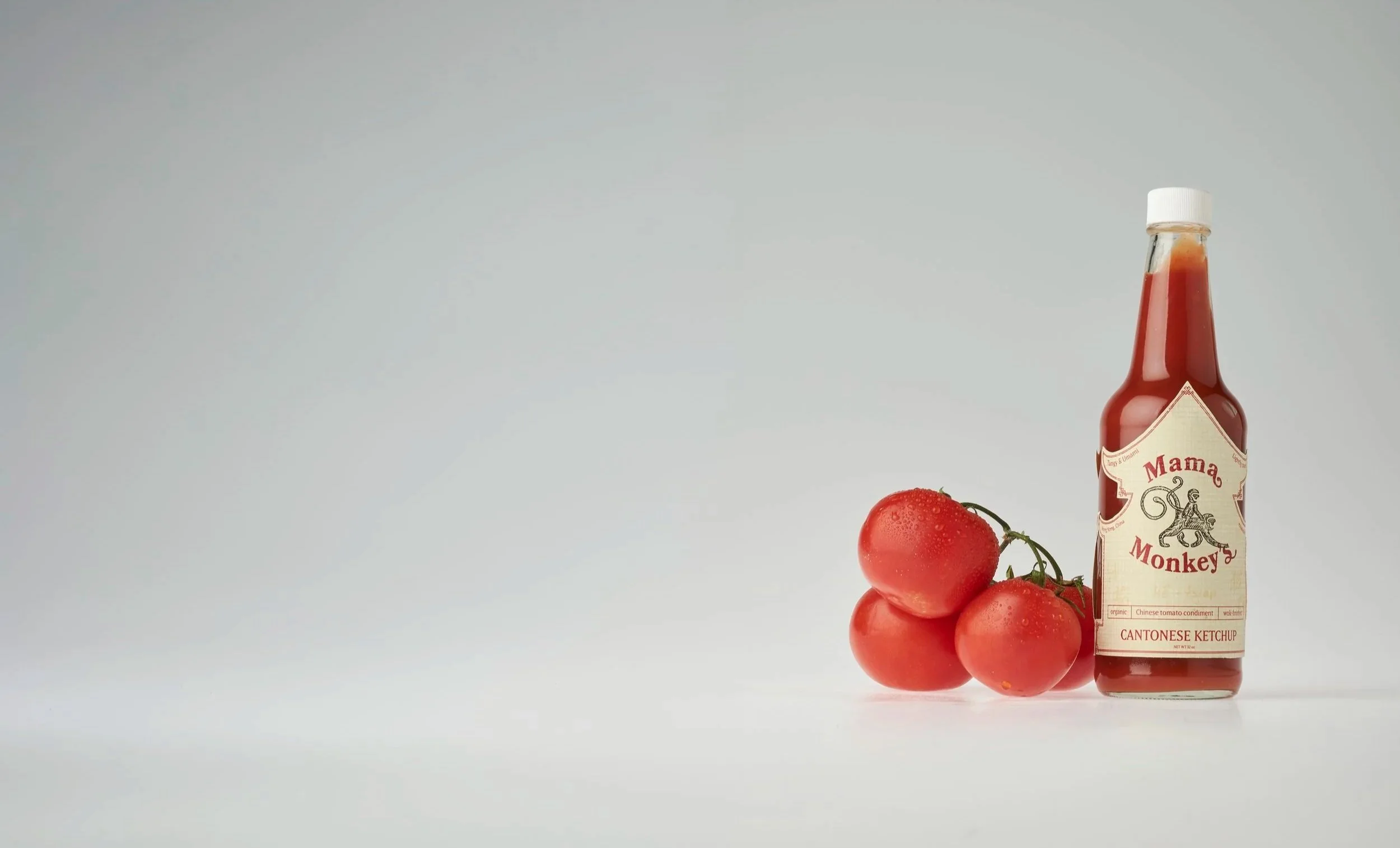
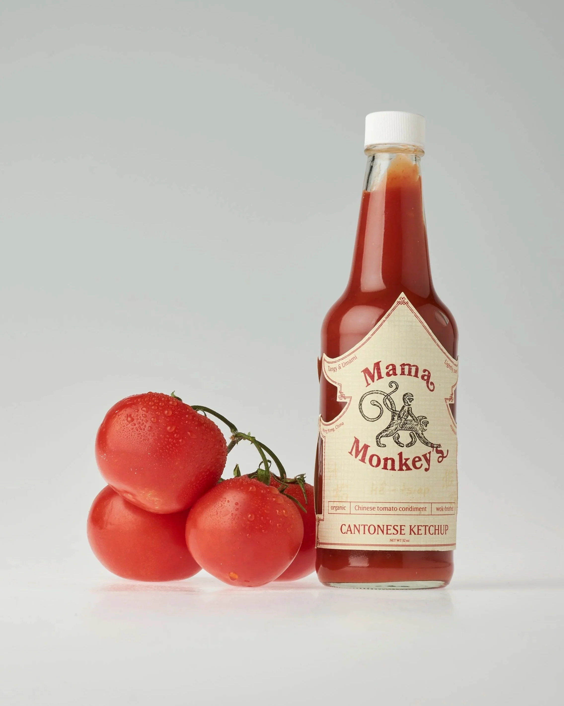
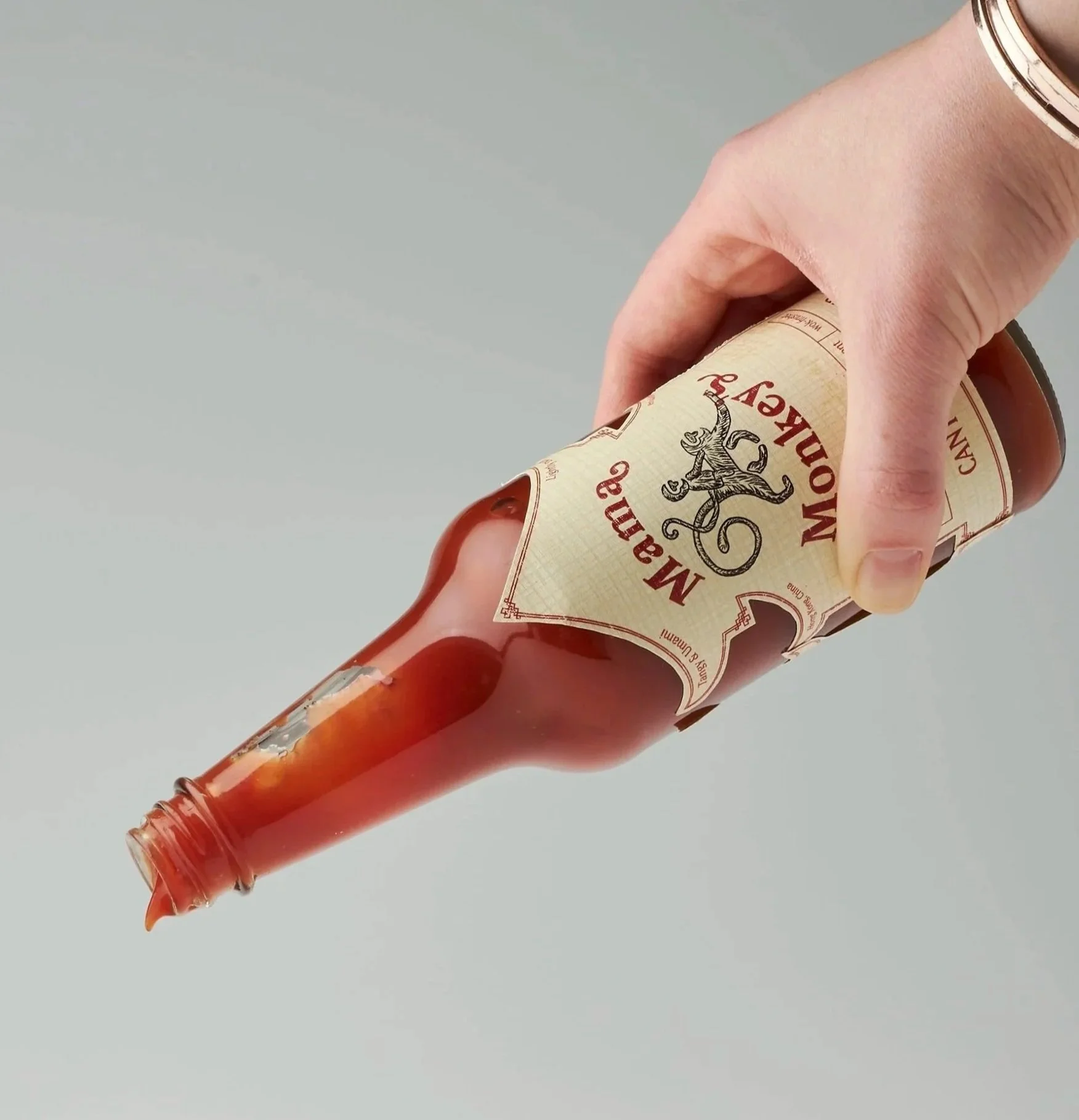
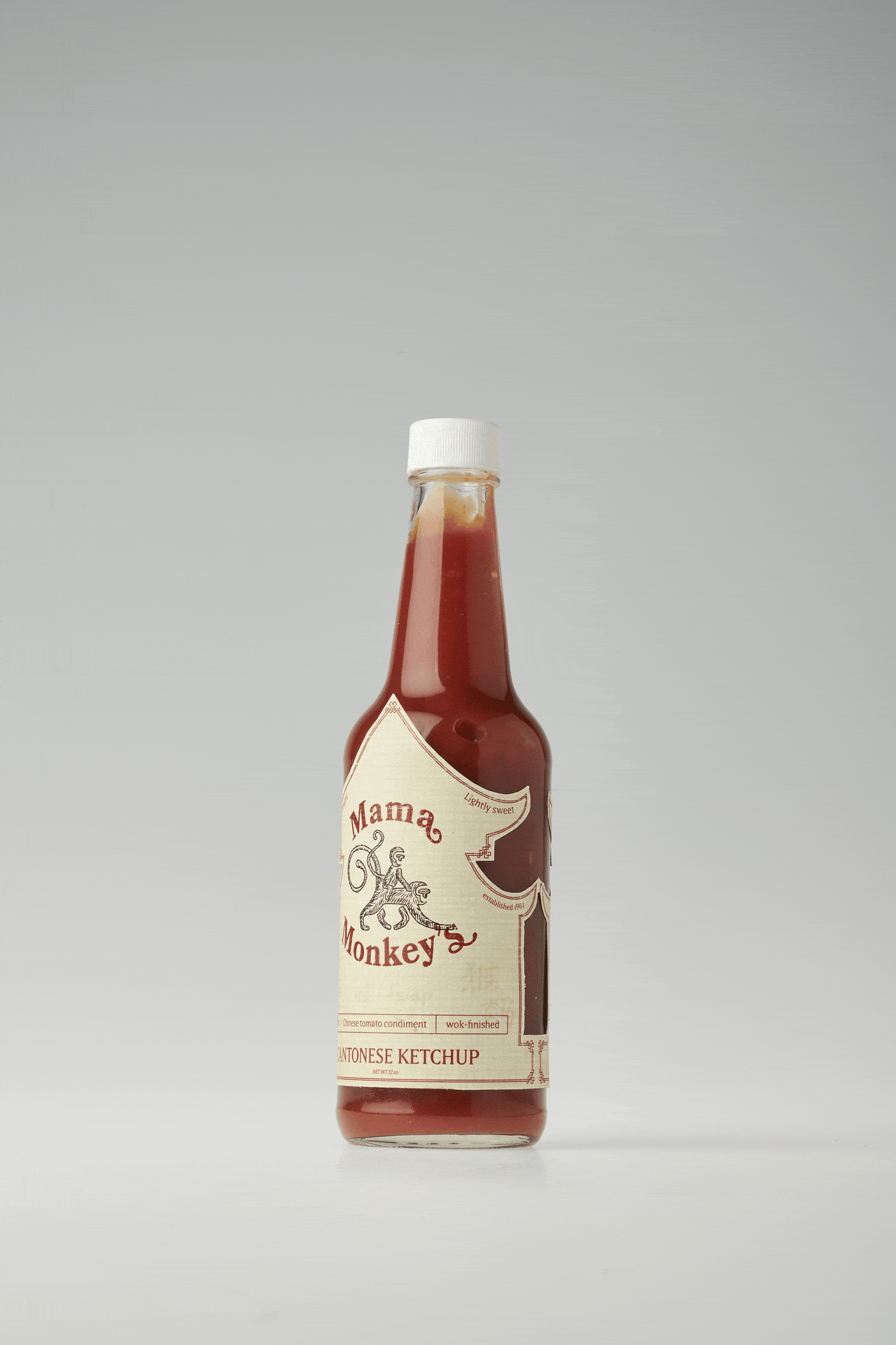
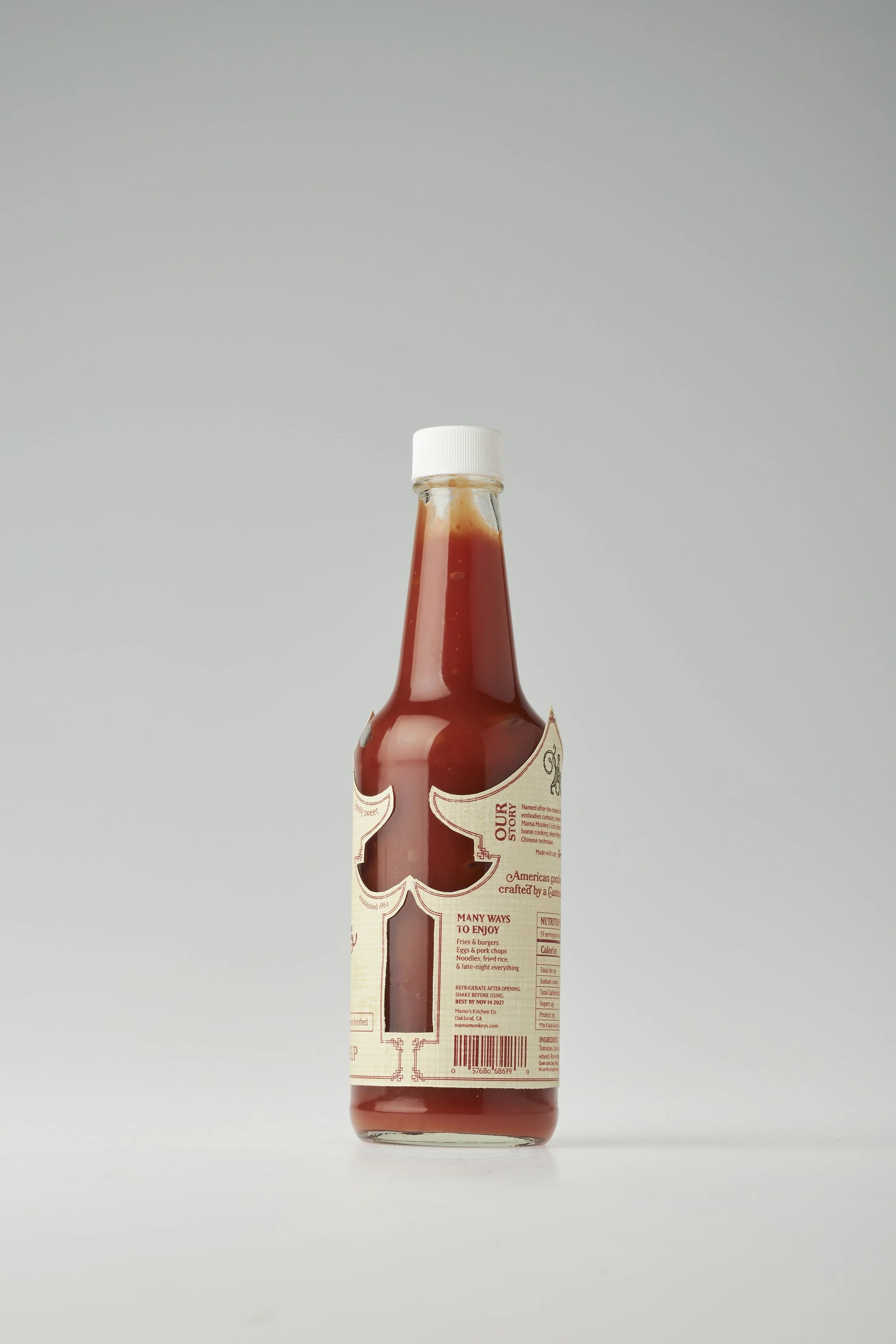
Mama Monkey’s is a sauce brand that blends Cantonese cuisine with American kitchens. This Cantonese Ketchup is a riff on the classic American condiment.
DISCIPLINES
Illustration
Storytelling
Packaging Design
TIMELINE
Winter 2026
7 weeks
TEAM
Solo Project
ROLE
Graphic Designer
Illustrator
PROJECT BRIEFDesign a label for a food or beverage with a non paper-based container that communicates your identity or serves a community you identify with. Attract potential customers, explore ways to resonate with the consumers, and provide enjoyable interactions.
CONCEPTThis brand traces ketchup back to Southern China, where it began as a fermented fish paste called ke-tsiap. Western traders discovered and then transformed it into the tomato condiment we know today. This homemade twist on a classic sauce honors my mom’s Cantonese culture while nodding to the iconic Heinz ketchup. The brand name reflects my birth year as well as the monkey’s wit and playfulness.
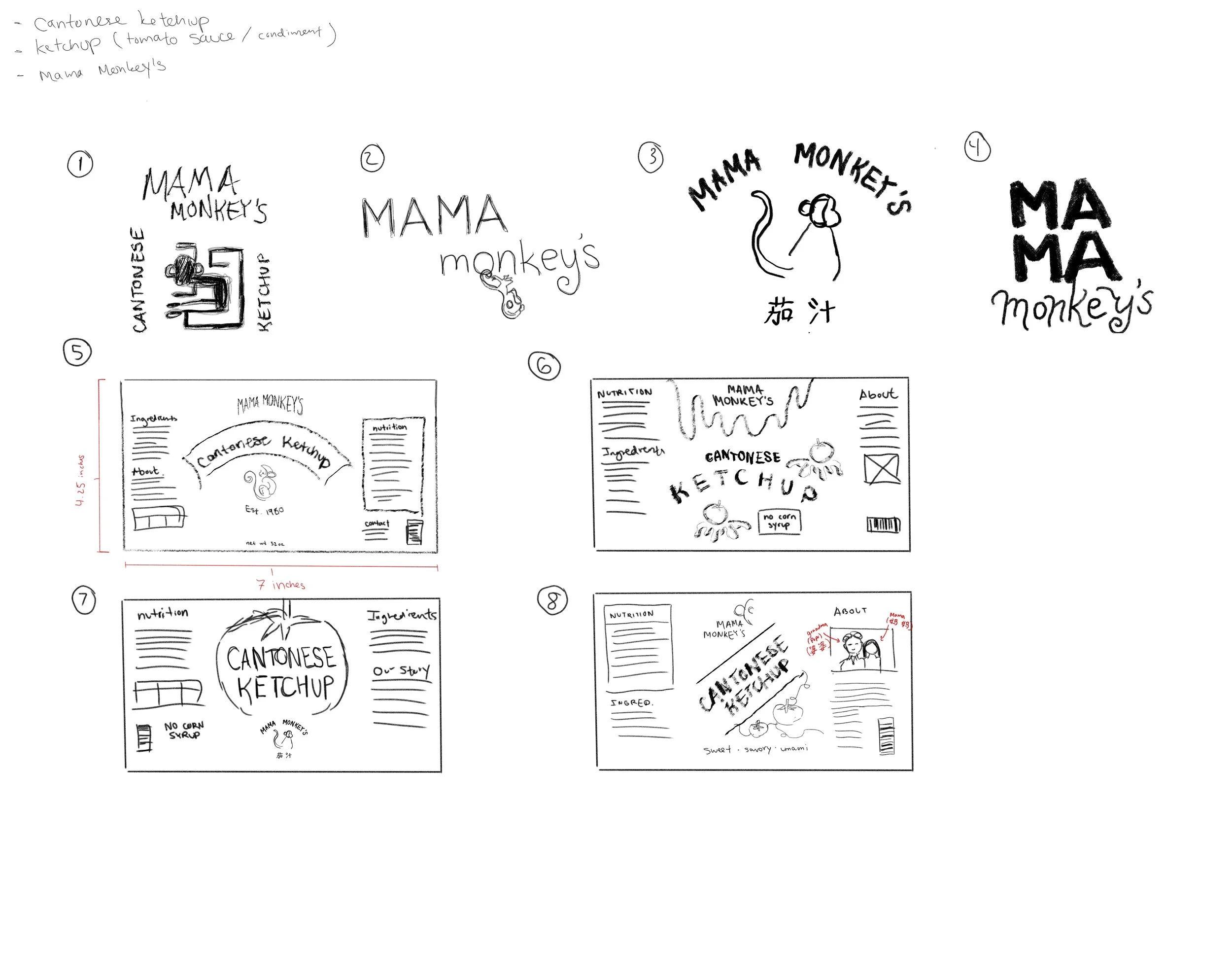
Process
Gathered inspiration and visual references for illustration styles, cultural patterns and motifs, color palettes, bottle shapes, and type implementation.
IDEATION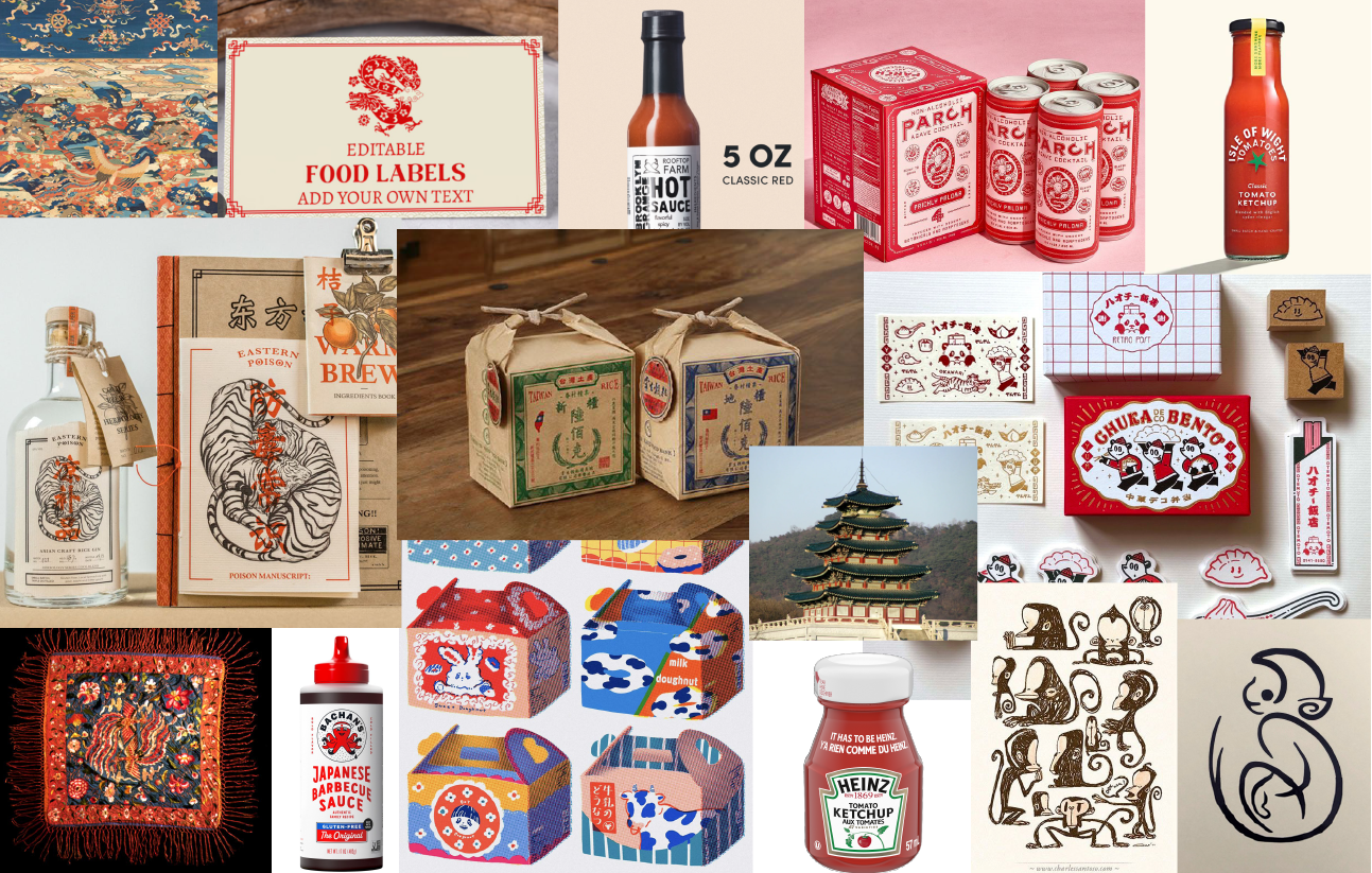
STRATEGIESTextured Paper
Use cream linen stock for dimensionality and to create a tactile experience for the consumer.
Location Specific
Lean into recognizable cultural motifs to convey the heritage component that is defining to this project.
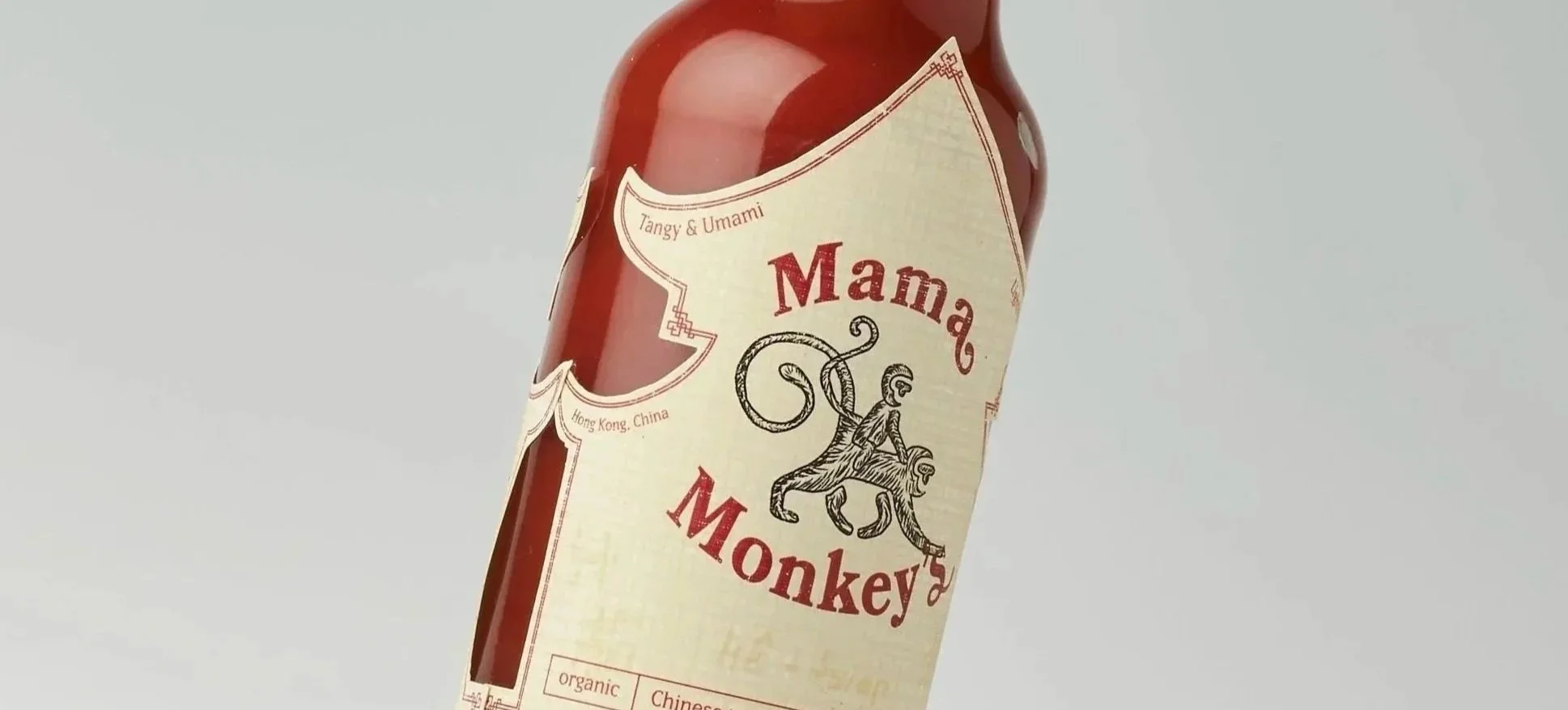
Mascot
Create a single-color mascot to show the personality of the brand and an image that they can easily recognize and connect to.
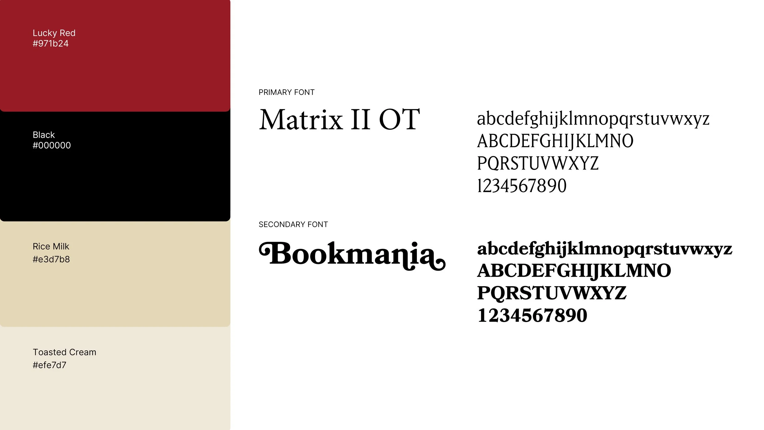
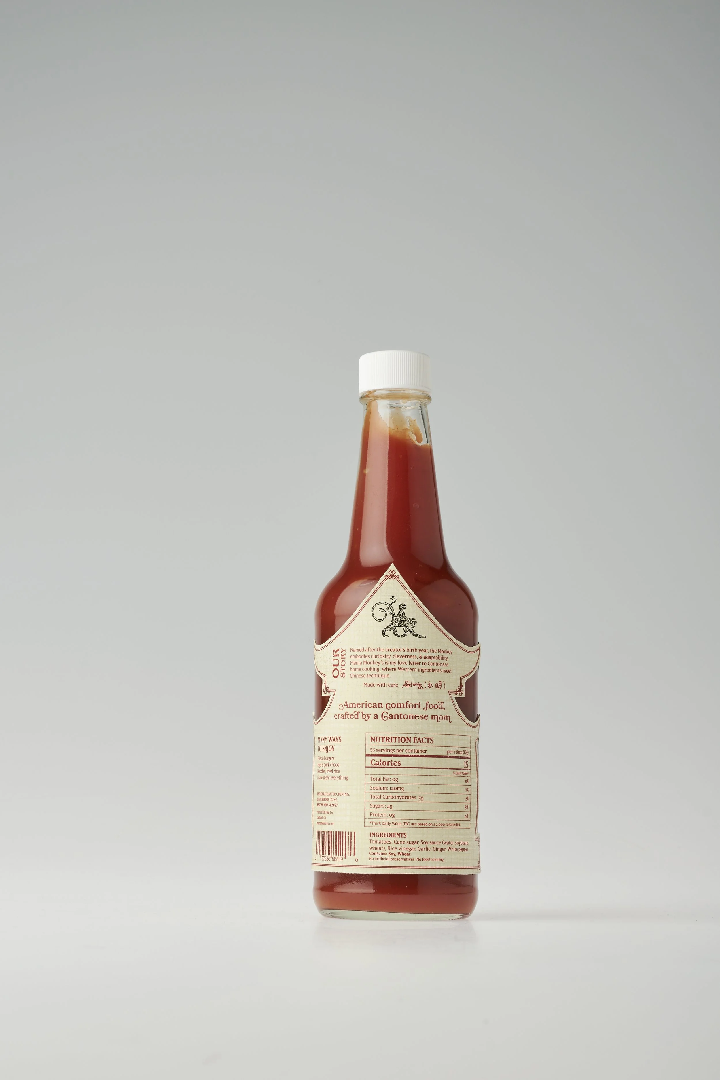
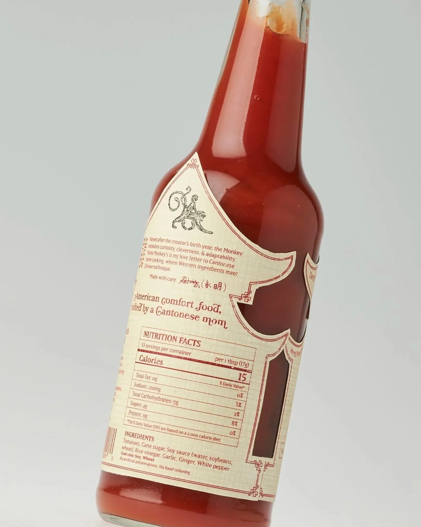
COLOR & TYPETAKEAWAYSRed symbolizes prosperity and good fortune. I chose it not only for its cultural resonance, but also to complement the natural color of the product. The cream linen paper gives a tactile warmth that contrasts with the richness of the red.
For the type, I selected serif typefaces to convey establishment. The incorporation of glyphs mimicked the monkeys' movement and created balance between the illustration and logotype.
COLOR & TYPE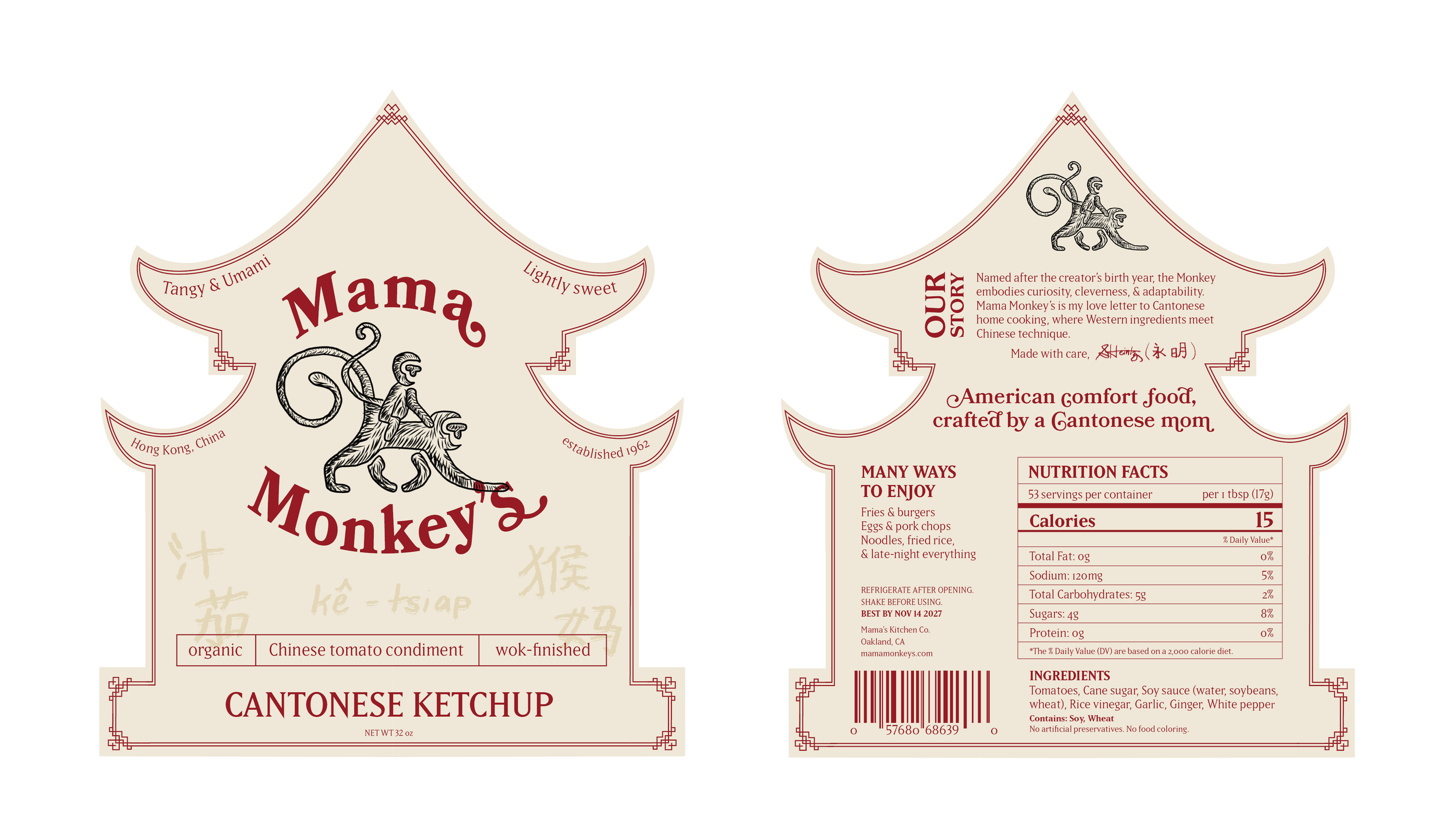
SKETCHES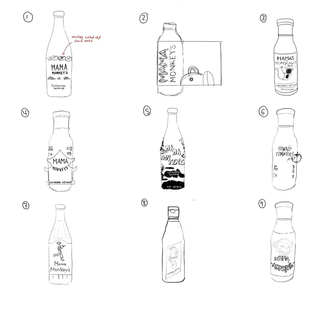
For next time…
TAKEAWAYSI loved getting the opportunity to showcase my culture and background through this project. One of the main challenges was this Chinese pagoda label shape, especially adhering it to the bottle, but it also turned out to be a fun constraint to work with. I would love to create many more bottle labels this summer when I have a bit of spare time.